Monday, November 23, 2009

Propaganda Poster

Intentional vagueness

Generalities are deliberately vague so that the audience may supply its own interpretations. The intention is to move the audience by use of undefined phrases, without analyzing their validity or attempting to determine their reasonableness or application. The intent is to cause people to draw their own interpretations rather than simply being presented with an explicit idea. In trying to "figure out" the propaganda, the audience forgoes judgment of the ideas presented. Their validity, reasonableness and application may still be considered.


vague- not clearly or explicitly stated or expressed: vague promises.


In the poster above, the artist uses an illustration to show the viewer the message trying to be portrayed. The artist uses very few words but in no way has any commands in the text, as in "Do this". The artist uses imagery to allow the viewer to come up with their own assumption.


In this poster, the artist once again uses very few words but uses them in a suggestive way. "We can do it" is a very vague term which can mean many things but the strong woman in the picture holding up her shirt to show her muscles gives a message that allows the viewer to come up with their own interpretation.


Once again, this poster here does the same as above. Progress can mean many things, but with paired with a picture of Obama, it is left up to the viewer to interpret the meaning.


This poster is very interesting and influencing to me. It has no text at all and allows the viewer to come up with their own interpretation by the few visual elements that are provided, like the nuke bomb and the needle creating cross bones.



Wednesday, November 4, 2009

Monday, October 26, 2009

Gilbert Shelton


FABULOUS FURRY FREAK BROTHERS, 1972


"Wonder Wart-Hog", 1962


Wes Wilson


Cartel de Wes Wilson y Bill Graham, de 1967


Stanley Mouse


Mr. Saturday Night


Sunset Jester


Sun Lion


John Van Hamersveld


LA '68


CREAM at Madison Square Garden: 2005 Reunion Poster


Rick Griffin


The Man From Utopia, 1972


Victor Moscoso

Irom Butterfly, Oct 17,18,19, 1968, (also by Rick Griffin)


1960


Houses in Motion, 1986


Alton Kelley

Grateful Dead show in 1967


Daily Flash, November 18-19, 1966


Bo Diddley, August 5, 1966


Band Poster Research

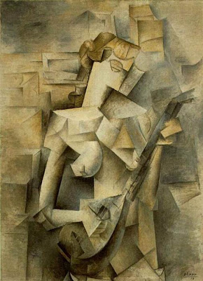
Cubism


In cubist artworks, objects are broken up, analyzed, and re-assembled in an abstracted form—instead of depicting objects from one viewpoint, the artist depicts the subject from a multitude of viewpoints to represent the subject in a greater context. Often the surfaces intersect at seemingly random angles, removing a coherent sense of depth. The background and object planes interpenetrate one another to create the shallow ambiguous space, one of cubism's distinct characteristics.

Wednesday, October 14, 2009

Leonetto Capiello


Le
onetto Capiello,April 1875 in Livorno, Italy – 2. February 1942 in Cannes, France,Arts & Crafts movement, 'the father of modern advertising' because of his innovation in poster design and I find this piece beautiful because colors are eye popping. The yellow background catches your attention and the black dress pops in front of it. Your eye starts at the top of her red feather hat and your eye moves down her body until you see the words.
http://en.wikipedia.org/wiki/Leonetto_Cappiello


Monday, October 12, 2009

3 YARD BOYS

3 Yard Boys; early '70s; includes artists such as Jace 2, Stan 153, and Rome 150; graffiti art movement; 3yb became quite possibly the most famous bombing crew ever. This crew had more true all city kings than almost any crew in history. ; I honestly love this work because they incorporate colors that compliment each other and use a font that describes themselves personally. Each font is unique to each person. Each member has their own flare and brings something new to the table.

Sunday, October 4, 2009

Michael Beruit & Jules Cheret

Michael Beruit, Green Patriotism Campaign, 2008,


I find this piece interesting because the color and font scheme are very simple and clean. They are modern in a sense with current political issues but it has a classic and traditional feel to how an effective ad should look like. I especially enjoy that creativity that he used in using the green man in all of the ads.

He has won hundreds of design awards and his work is represented in the permanent collections of the Museum of Modern Art (MoMA), the Metropolitan Museum of Art, and the the Cooper-Hewitt, National Design Museum, all in New York; the Library of Congress in Washington, D.C.; the Museum für Kunst und Gewerbe, Hamburg, Germany; and the Musee des Arts Decoratifs, Montreal. He has served as president of the New York Chapter of the American Institute of Graphic Arts (AIGA)AIGAArchitectural League of New York and of New Yorkers for Parks. In 1989, Bierut was elected to the Alliance Graphique Internationale, in 2003 he was named to the Art Directors Club Hall of Fame, and in 2006 he received the profession’s highest honor, the AIGA Medal, in recognition of his distinguished achievements and contributions to the field. In 2008 he received the Design Mind Award in the National Design Awards presented by the Cooper-Hewitt, National Design Museum, Smithsonian Institution. from 1988 to 1990 and is president emeritus of National. He currently serves as a director of the Bierut is a Senior Critic in Graphic Design at the Yale School of Art. He is co-editor of the anthology series Looking Closer: Critical Writings on Graphic Design, published by Allworth Press, and in 1998 he co-edited and designed the monograph Tibor Kalman: Perverse Optimist. He is a co-founder of the weblog Design Observer and his commentaries about graphic design in everyday life can be heard nationally on the Public Radio International program “Studio 360.” His book Seventy-nine Short Essays on Design was published by Princeton Architectural Press in 2007.


Jules Cheret, 1836-1932, Exposition Universelle des Arts Incoherents


A French painter and lithographer who became a master of Belle Epoque poster art. Often called the father of the modern poster.


I enjoy this piece because of the colors the artist chose to use to convey a sort of creepy scary look. Instead of using a lot of black and gray, the artist chose to use pinks and blues, which is not seen very often. I enjoy how the artist uses a calligraphy font face.